
MIND4MED – KNOWLEDGE WITH ITS MARK
There are brands born from the need of the heart. And there are those born from a need for… order in science.
MIND4MED is a startup that connects the worlds of research, public health, and science into a cohesive, meaningful whole.
Where others see the impossible, it sees a solution. Where others hear technicalities and procedures, it sees people, projects, and development. When the idea arose to give this vision a visual form, a question followed: what does intelligence in action look like?
The answer is a visual identity designed by Optima Marketing Group. Minimalist. Decisive. Built on the balance between "mind" and "med."
MIND4MED connects these two worlds, symbolically serving as a bridge between thought and practice. It’s no coincidence: bringing together skills, people, and institutions, to make science more effective, is written into the brand’s DNA.
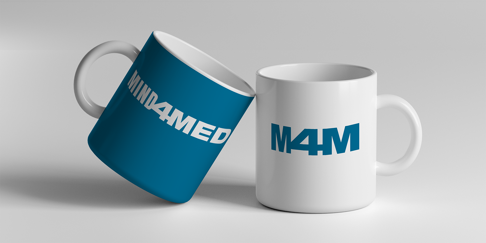
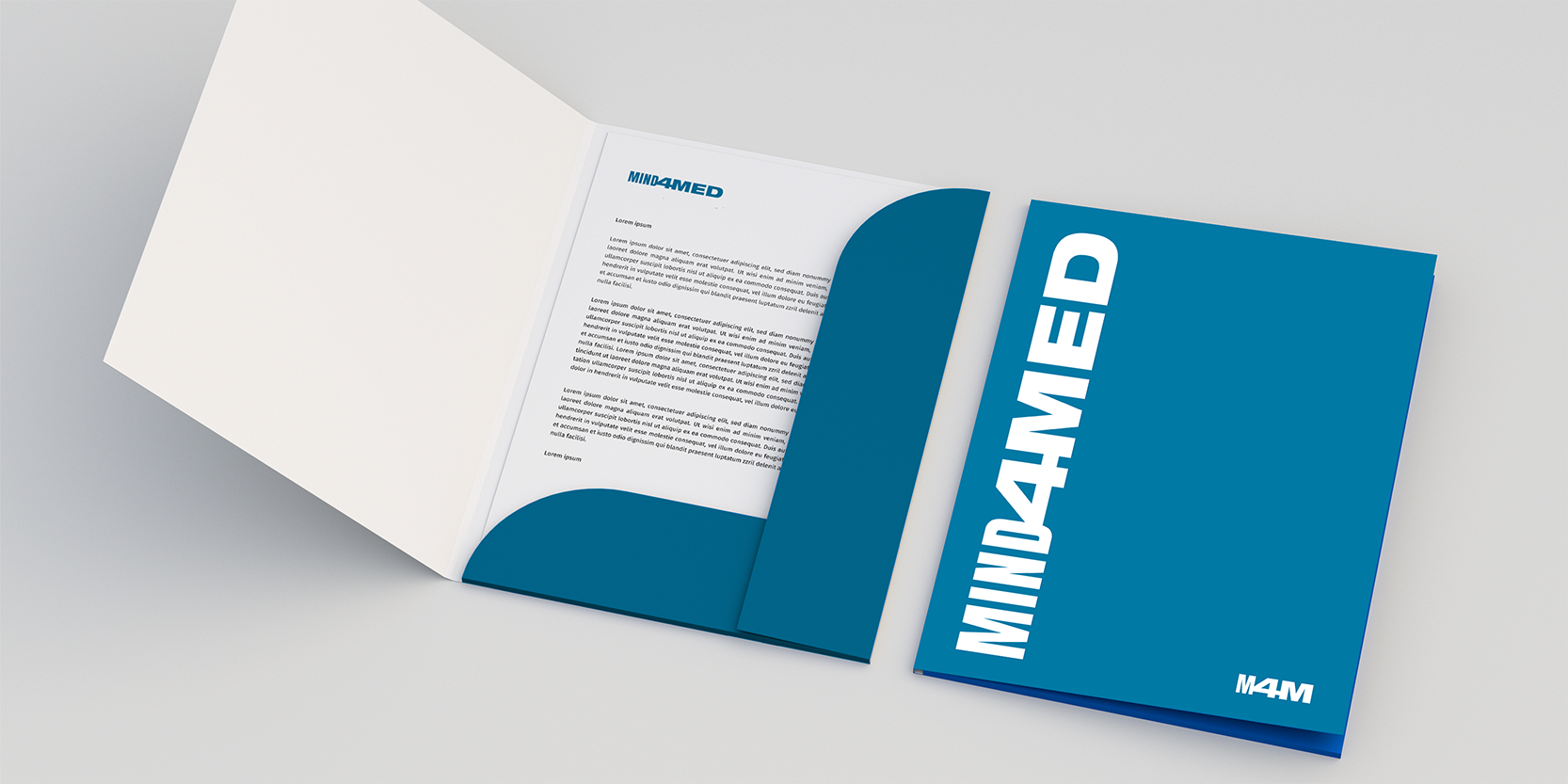
The color? Deep blue - a shade of trust, calm, and professionalism. No clutter. No forced metaphors. The typography? Bold, geometric, confident. The kind that doesn't need to shout to be heard.
MIND4MED is a brand built on the idea of smart action. Because in the world of medicine, science, and administration, it’s not about emotion - it’s about precision. And precision can be beautiful, too.
Copyrights 2019. All Rights Reserved